<style>
.container {
font-size: 40px;
min-height: 300px;
width: 100%;
background: LightGray;
display: grid;
grid-template-columns: 1fr 1fr 1fr;
grid-template-rows: 1fr 1fr 1fr;
grid-gap: 10px;
}
.item1{background: LightSkyBlue;}
.item2{background: LightSalmon; }
.item3{background:PaleTurquoise;}
.item4{background:LightPink;}
.item5{background:PaleGreen;}
</style>
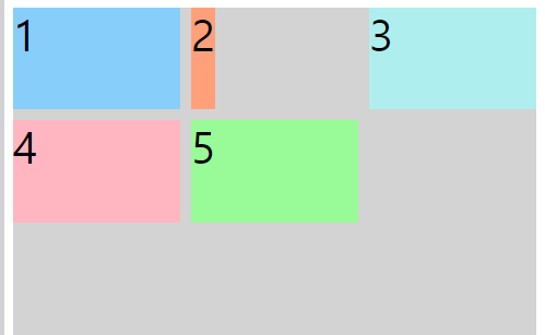
<div class="container">
<div class="item1">1</div>
<div class="item2">2</div>
<div class="item3">3</div>
<div class="item4">4</div>
<div class="item5">5</div>
</div>
justify-self
css grid-layout 셀 내부의 위치를 가로로 정렬
기본 값 :stretch ( 셀의 전체 너비를 채움)
상자 2에 justify-self의 속성을 사용해보자
- start : 내용을 셀 왼쪽에 정렬
- center : 내용을 셀 중앙에 정렬
- end : 내용을 셀 오른쪽에 정렬
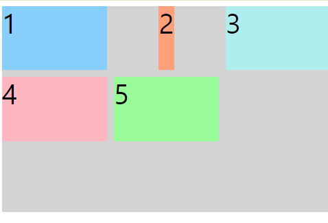
.item2 {
    background: LightSalmon;
    justify-self : start

  }
.item2 {
    background: LightSalmon;
    justify-self : center

  }
.item2 {
    background: LightSalmon;
    justify-self : end

  }
'

justify-items
모든 항목에 대해 적용 하고 싶을 때
<style>
.container {
    font-size: 40px;
    min-height: 300px;
    width: 100%;
    background: LightGray;
    display: grid;
    grid-template-columns: 1fr 1fr 1fr;
    grid-template-rows: 1fr 1fr 1fr;
    grid-gap: 10px;
  }
  .item1{background: LightSkyBlue;}
  .item2{background: LightSalmon; }
  .item3{background:PaleTurquoise;}
  .item4{background:LightPink;}
  .item5{background:PaleGreen;}
</style>

<div class="container">
  <div class="item1">1</div>
  <div class="item2">2</div>
  <div class="item3">3</div>
  <div class="item4">4</div>
  <div class="item5">5</div>
</div>
5개의 상자를 감싸고 있는 컨테이너 클레스에 justify-items 속성 사용
justify-items : center
.container {
    font-size: 40px;
    min-height: 300px;
    width: 100%;
    background: LightGray;
    display: grid;
    grid-template-columns: 1fr 1fr 1fr;
    grid-template-rows: 1fr 1fr 1fr;
    grid-gap: 10px;

    justify-items: center;

  }
justify-items : start
.container {
    font-size: 40px;
    min-height: 300px;
    width: 100%;
    background: LightGray;
    display: grid;
    grid-template-columns: 1fr 1fr 1fr;
    grid-template-rows: 1fr 1fr 1fr;
    grid-gap: 10px;

    justify-items: start;

  }
justify-items : end
.container {
    font-size: 40px;
    min-height: 300px;
    width: 100%;
    background: LightGray;
    display: grid;
    grid-template-columns: 1fr 1fr 1fr;
    grid-template-rows: 1fr 1fr 1fr;
    grid-gap: 10px;

    justify-items: end;

  }
'CSS' 카테고리의 다른 글
| [CSS] display: flex (justify-content) (0) | 2021.01.01 |
|---|---|
| [CSS ] 세로 가운데정렬 : align-self , align-items (0) | 2020.12.29 |
| HTML, CSS 색 코드 (0) | 2020.12.21 |
| display : inline , block, inline-block (0) | 2020.12.21 |
| CSS - background 속성 (0) | 2020.12.21 |

